Wait. What? Then who do I ask to design my website? A web designer, that’s who. Graphic designers are not necessarily web designers. Sure, there’s plenty of overlap and ultimately both are charged with making things visually pleasing. However there are fundamental differences between the two roles and the skillsets they require. In this blog, we’ll take a look at these and demonstrate why it’s important to get the right person to design your website.
On the face of it, there isn’t a great difference between graphic and web design; both are concerned with layout, visuals, colour, brand, taking the viewer on a journey and so forth. But dig a little deeper and there’s a fundamental difference in the influence the designer has on the output. In a design for print such as for a brochure, the designer has direct influence over the output with their design faithfully recreated in ink. However, with websites there’s a large and complex translation between design and code taking place. A website is almost always a more complex, dynamic, interaction-rich medium too, meaning function and usability are as important as aesthetics.
Understanding how websites are built
During the web development process the original design has to be translated into HTML using various technologies. The web developer is constrained by the software and technology used to build and run websites. Those limitations mean that some designs are harder to build than others, or possibly cannot be achieved at all. And it’s understanding this technology and the web development process that means a graphic designer can’t simply apply their creative skills to websites and expect great results.
The important point here is that a web designer should understand how websites are built. That doesn’t necessarily mean they must be able to write the code and build it themselves, but a grasp of the construction fundamentals is key. Let’s look at these fundamentals in a little more detail:
User experience design (UXD or UED)
Wikipedia defines this as: “the process of enhancing customer satisfaction and loyalty by improving the usability, ease of use, and pleasure provided in the interaction between the customer and the product.”
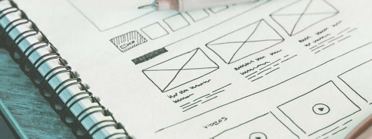
While UXD can itself be an entire skillset and even a dedicated job, a web designer worth their salt has some knowledge and experience of good UXD practice: where to place items on a site to maximise effectiveness, wireframe production, visual hierarchies, calls-to-action, proximity and alignment, and so on.
Responsiveness, grid layouts and consistencies
We were recently given a web design and asked to build it into HTML templates. After studying the designs it was strikingly obvious that the site had been designed by a print designer (which was later confirmed). What gave it away?
Firstly, they’d designed for desktop screens only. No thought had been given to how the site would work responsively, let alone designs or wireframes provided for other screen sizes. With it widely acknowledged that mobile internet use has now surpassed desktop internet access, websites should be designed and built mobile-first; it really shouldn’t be an afterthought. Or in this case, a no-thought.
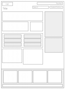
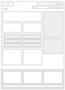
Secondly, the site was 1007px wide. Not a well-known width to design a website to! The site had not been designed with a grid in mind at all, which is poor practice from a design viewpoint, and even worse from a web development one. The vast majority of modern sites are built using responsive grid frameworks such as Bootstrap and Foundation. These encourage you to build to grids as it makes both design and development sense. As the wireframe below demonstrates, the lack of consistency in column sizes and in gutter widths (the gaps between the columns) meant that nothing aligned. An OCD nightmare! And as a result, the build was considerably harder than it needed to be.
Finally, there were inconsistencies in font-sizes (headings of the same level varying in size across different pages), spacing and link styles (some underlined, some not, some coloured) throughout. Just like designing to a grid, it’s generally good design practice to apply as much consistency as possible in a design. For someone who’s ever written or at least understands CSS, it’s even more critical, because inconsistencies in design result in many extra lines of code. The more consistently rules are applied to a web design, the less CSS code needs to be written. It’s that simple.
Web technologies
Understanding what web technologies are available to the developer is very useful to the designer. Web fonts are perfect examples. This technology allows you to use non-standard fonts on the web. By understanding these font libraries, how they work and knowing which fonts they contain, the web designer can select fonts which can be accurately rendered on the website. If the designer chooses a font which isn’t available as a web font, the web developer is left to find an alternative (which given the poor selection of standard fonts, might be totally different to what was intended) .
Similarly, web icons such as Font Awesome are a great addition to the web designer’s arsenal. They have much simplified the use of icons on a website. A web designer who knows about them can then use them throughout their design knowing they will be simple to include on the finished site.
The takeaway
It’s worth stating that some graphic designers are also excellent web designers. Indeed a fair few have learnt both, including myself. But the point is that being a quality graphic designer does not automatically make you a quality web designer. And I personally believe that the more knowledge you have of how websites are built, the better web designer you make. Your sites will be easier to build, run faster, will work better across different platforms, more accurately replicate the original design and will most likely offer better usability.
Really, it boils down to this: it’s about getting the right person to do the job. After all, you wouldn’t ask an electrician to fix your broken toilet, would you?
If you’re considering a new website, please get in touch for an informal chat about how we can help.


