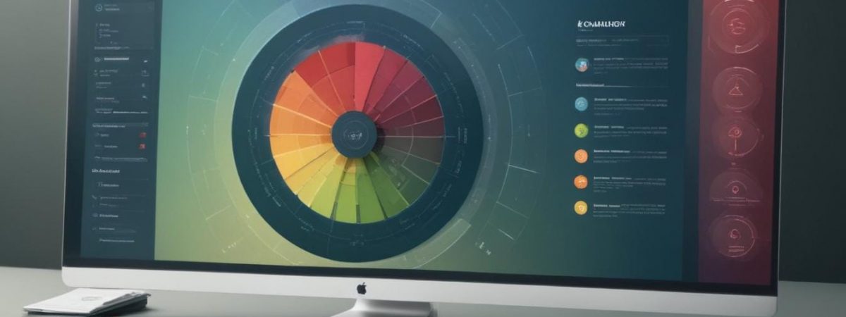
When it comes to crafting an engaging and effective online presence, colour psychology plays a significant role in influencing user behaviour. From evoking emotions to shaping perceptions, the colours you choose for your website can have a profound impact. Whether you’re an e-commerce shop or a local Website Design business, understanding the psychology of colour is key to leaving a lasting impression.
Why colour matters in website design
Colours have a deep connection to human emotions and behaviour. Different hues can evoke varying responses based on culture, personal experience, and even current trends. For instance, blue often promotes trust and calmness, while red can evoke passion or urgency. When used strategically in website design, colours go beyond aesthetics—they influence decision-making, retention, and conversion rates.
Consider how users interact with your site. The right colour palette can guide them towards taking desired actions, such as clicking a call-to-action button or completing a purchase. Conversely, clashing or overly bright colours can create a negative experience, pushing users away. For businesses like those specialising in Website Design, aligning the colour strategy with brand identity and audience preferences becomes an essential step in achieving success.
The psychology of key colours
Let’s explore some commonly used colours and their psychological effects:
- Blue: Associated with trust, security, and professionalism. Excellent for financial, tech, and healthcare industries.
- Red: Conveys energy and urgency, making it ideal for sales campaigns or limited-time offers.
- Green: Often linked to nature, health, and growth. It’s favoured by eco-friendly brands and health-focused companies.
- Yellow: Represents optimism, cheerfulness, and creativity. Great for grabbing attention but should be used sparingly.
- Black: Reflects sophistication, luxury, and modernity. Commonly used in high-end fashion or premium products.
When tailoring your site, consider a mix of primary and accent colours. Balance is key, as an overwhelming palette can confuse users, while a thoughtful one encourages exploration and action.
Key takeaways for colour selection
To effectively use colour in Website Design Hampshire or any other region, follow these tips:
- Know your audience: Research your target demographic to understand colour preferences that resonate with them.
- Align with your brand: Ensure the colour scheme reflects your brand’s values and identity. Consistency is vital for trust and recognition.
- Use contrast wisely: Make important elements like call-to-action buttons stand out by applying contrasting colours.
- Test and adjust: Conduct A/B testing to determine the most effective colour combinations for user engagement and conversions.
With these guidelines, businesses and designers can craft visually appealing and emotionally engaging websites that not only look good but also perform effectively.
Final thoughts
The psychology of colour is a fascinating yet practical aspect of website design. By strategically choosing colours that align with your audience and goals, you create a user experience that’s visually cohesive and impactful. If you’re looking for expert advice or a complete website overhaul, consider reaching out to professional Website Design in Hampshire services. Elevate your online presence with a colour palette that truly speaks to your audience.
