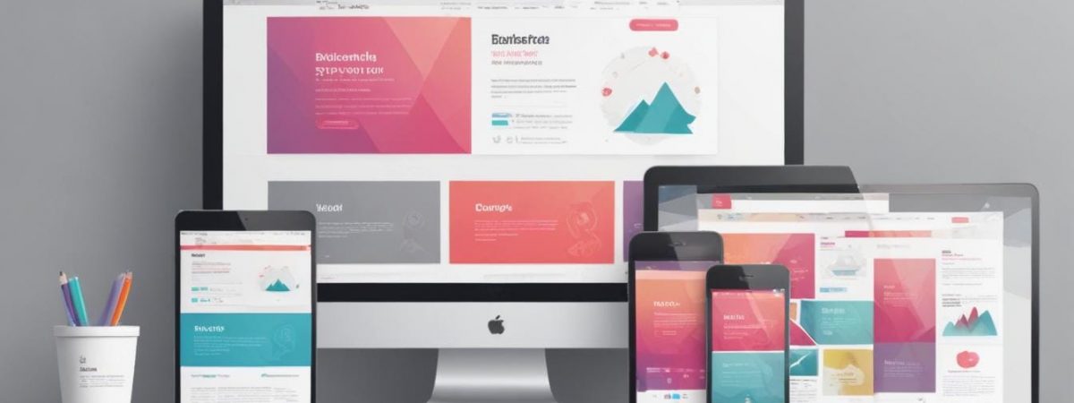
When it comes to designing a modern website, two approaches often come into play: responsive and adaptive design. Each method has its own strengths, and the choice between them can significantly impact your user experience, loading speeds, and overall functionality. If you’re looking for website design, having a clear understanding of these design methodologies can help you make an informed decision that aligns with your goals and audience expectations.
What is responsive design?
Responsive design is a web development approach where a single website layout dynamically adjusts to fit any screen size. By using fluid grids, flexible images, and media queries, this method ensures that the website provides an optimal viewing experience across devices, from desktops to smartphones. Essentially, the website layout “responds” to the user’s screen dimensions and orientation.
One of the standout benefits of responsive design is its simplicity. A single version of your website can effectively adapt to any device, requiring less maintenance in the long run. Responsive websites are also better suited for search engine optimisation (SEO), as they generally load faster and create a seamless user experience, which search engines prioritise.
What is adaptive design?
Adaptive design, on the other hand, creates multiple fixed layouts tailored to specific screen sizes. When a user visits your website, the design that best matches their device is automatically selected and displayed. Instead of responding to each screen size dynamically, adaptive design relies on pre-defined breakpoints, such as layouts for desktops, tablets, and smartphones.
Adaptive design shines when it comes to customisation. You have full control over how your website appears on each device, enabling you to optimise the user experience for specific screen types. However, this approach can be more time-consuming and resource-intensive to maintain, as it essentially requires managing multiple versions of your site.
Responsive vs adaptive: which is best for you?
Choosing between responsive and adaptive design often comes down to your website’s goals, resources, and audience. Here’s a quick comparison to help you decide:
- Cost and maintenance: Responsive design tends to be more cost-effective and easier to maintain in the long term due to its single-layout approach.
- Customisation: Adaptive design offers more precise control over the user experience on different devices, but it requires more effort and budget to implement effectively.
- SEO: Responsive design generally performs better for SEO because it delivers faster loading times and avoids the potential pitfalls of duplicated content across multiple site versions.
- Performance: Adaptive design may offer faster load times for some devices since it serves optimised layouts specifically designed for those screens.
If you’re targeting a diverse audience that uses a variety of devices, responsive design is often the best choice. However, for websites with a specific audience segment, such as an app with unique functionality best suited for mobile users, adaptive design may be the better option. Consulting experts in website design can help you weigh the pros and cons in detail.
Key considerations when choosing your design approach
To make the right decision, consider the following factors:
- Your audience: Analyse your audience’s preferred devices. If most users visit your site on smartphones, a mobile-first adaptive design could be advantageous.
- Your budget: Adaptive design often requires more upfront investment compared to responsive design.
- Your content: If your website heavily relies on multimedia content, you’ll need to ensure fast loading speeds and seamless navigation on all devices.
- Your long-term strategy: Consider how often you plan to update the website. A responsive design requires less ongoing maintenance.
Ultimately, there’s no one-size-fits-all answer. Both responsive and adaptive designs have their advantages and limitations. The key is to focus on your business goals and user experience to make the most informed decision.
For professional support in creating a user-friendly and effective site, consider working with experts in website design. If you’re based in Hampshire, our website design Winchester services can guide you in crafting the ideal digital experience for your audience.
